Papago Hive Honey passion project:
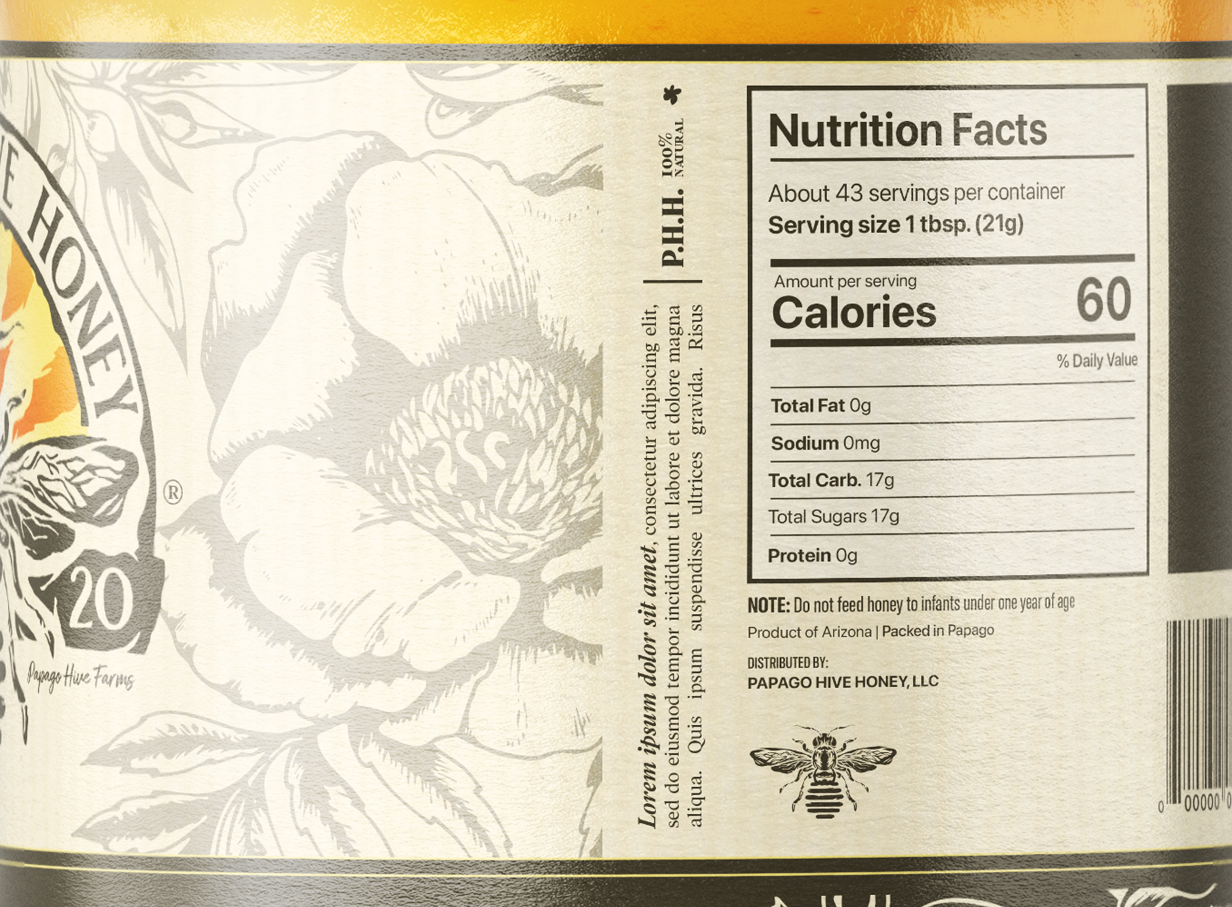
Logo Design, Label Design, Poster Design.
LA Fitness can benefit greatly from a brand repair. In this case study, I transform the brand into a compelling representation that attracts attention and captivates audiences.
Logo Design
This logo design encompasses the meaning behind Papago Hive Honey for a few reasons. The bee in the center of the half-crest represents the product of honey. Because Papago Hive Honey takes pride in their home, a starburst is evident behind the bee resembling hot and sunny Arizona. The worn half-crest further resembles the Arizonian deserts, giving the “wood” a vintage feel. All this combined rides a fine line between illustration and logo yet displays the needed amount of brand representation. When comparing all three variations, the abdomen of the bee changes accordingly to the flavor of honey.
Original Honey, Orange Blossom Honey, & Cinnamon Roll Honey
Label Design


